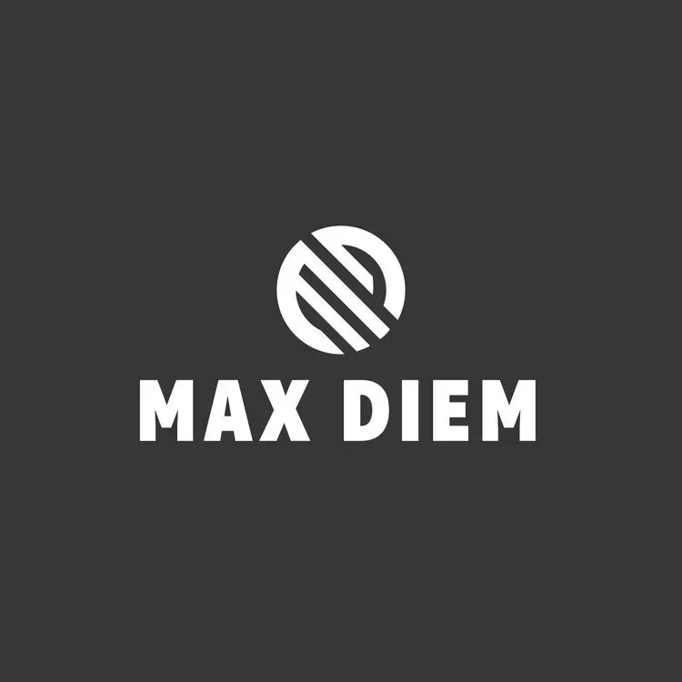
Max Diem
Logo Design
Scope: The client, a small athletic clothing brand, wanted a clean and impactful logo with strong contrast between dark and light elements. The goal was to create a design that felt bold yet simple — something that could easily stand out across apparel, marketing materials, and digital spaces as the brand expanded.
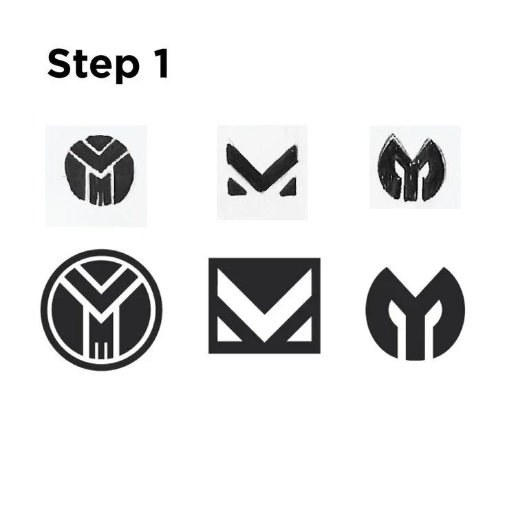
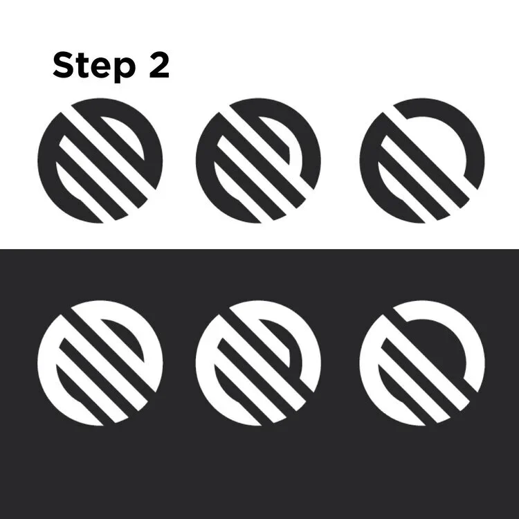
Challenge: The main challenge was finding the right balance between simplicity and distinctiveness. I wanted to design a logo that reflected the energy behind the name Max Diem — a play on the phrase carpe diem — while ensuring it remained easily recognizable and scalable as the brand grew. Crafting something minimal yet memorable required careful thought, refinement, and a focus on strong visual identity.